Page 1 of 9
New 2015 Jersey
Posted: Mon Oct 27, 2014 6:05 pm
by absentee
If you received your membership renewal pack today, you would have found this inside:
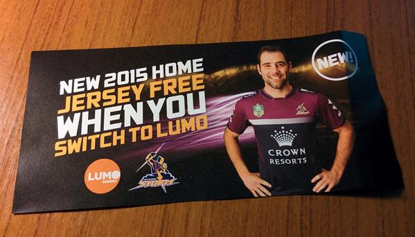
Thoughts?
I've seen a lot of negative reactions on Twitter - I must be the only one who likes it. Yes, it's different - but it's simple. Plenty of navy, plenty of purple and no lines, stripes or piping cluttering things. This jersey relies on the strength of our colours and I think our colours alone make for a solid jersey.
Surprised to see a new one for 2015, actually - we've only had the current one for two years.
Re: New 2015 Jersey
Posted: Mon Oct 27, 2014 6:29 pm
by KingHoweofIsrael
From what i can see, it looks pretty good! Though, i reserve the right to change my mind once i see it up close

Re: New 2015 Jersey
Posted: Mon Oct 27, 2014 7:24 pm
by yourhero
Sorry guys... I hate it

Looks like a t-shirt. A plain t-shirt. It also looks like they tried to make the Crown logo as big as possible.
Re: New 2015 Jersey
Posted: Mon Oct 27, 2014 7:48 pm
by Insomniac
Hate it. I agree with yourhero.
Looks more like something Manly would wear, and that's never a good thing. Personally, I like the Victorian V represented with the bolts, similar to our '06/'09 jerseys.
Re: New 2015 Jersey
Posted: Mon Oct 27, 2014 7:49 pm
by absentee
After resisting adding another sponsor below the collar for a few years it looks like we'll finally be joining the rest of the league by moving the BLK logo to the shoulders in order to make room. I guess it was only a matter of time. Looking at it again just now, I noticed that BLK have added #beyondlimitsknown under their logo.
And yeah, the Crown Resorts logo is too big. It's like we're trying to out-huge the Cowboys and their Toyota logo - or the Raiders and their Huawei logo. I'm betting the away version will swap out the navy body for white with the rest being the same. Expect a large navy box behind the Crown Resorts logo.
Re: New 2015 Jersey
Posted: Mon Oct 27, 2014 10:51 pm
by Mattpoet
needs the lightning bolt v, that is a direct Victorian reference and it is our heritage!
Re: New 2015 Jersey
Posted: Mon Oct 27, 2014 11:22 pm
by sallymay
I haven't liked it all day but it's growing on me...I wanna wait and see the guys playing in them before I say I totally hate it
Re: New 2015 Jersey
Posted: Tue Oct 28, 2014 10:14 am
by brisbanestorm
It will take a bit of getting used to not running around in lightning bolts, but I dont mind the jersey. Maybe it is too simple but I think that is much better than it being cluttered.
Only thing I'm not really a fan of is the fact that we have now changed our jersey twice to fit in with Crown. They should not have this much power over our brand after only being with us for 3 or 4 years.
Re: New 2015 Jersey
Posted: Tue Oct 28, 2014 1:32 pm
by Inglis#3
I like it a lot. It looks much better than last years. Looks cleaner and gives an appearance of more purple.
Re: New 2015 Jersey
Posted: Tue Oct 28, 2014 2:34 pm
by absentee
It's now up for pre-order on the Storm online store:
http://www.melbournestormshop.com.au/pr ... 344ppl.htm


No Programmed on the back - now with @storm on the collar.
Re: New 2015 Jersey
Posted: Tue Oct 28, 2014 2:42 pm
by sallymay
I kinda like it more now
Re: New 2015 Jersey
Posted: Tue Oct 28, 2014 6:19 pm
by mystormboys
Re: New 2015 Jersey
Posted: Tue Oct 28, 2014 6:25 pm
by Fizer
It has grown on me as the day has gone on. I like it now.
Re: New 2015 Jersey
Posted: Tue Oct 28, 2014 6:40 pm
by Turtle188
It's money I'll save next year by not buying one. Does nothing for me at all.
Re: New 2015 Jersey
Posted: Tue Oct 28, 2014 7:47 pm
by blazza18