The Jerseys, Merchandise and Sponsorship Thread
-
LESStar58

- Tropical Cyclone

- Posts: 2138
- Joined: Wed Jul 28, 2004 6:50 pm
- Location: balls deep in your love...
- Contact:
Hopefully naff "fashionable" necklines are not the next big thing in rugby league jerseys.yourhero wrote:Yeah, no club will go back to a proper collar full time (just another thing for tacklers to grab) but they may colour the hemline around the neck at some point.
From the one new ISC jersey with a 2018 collar I’ve seen, it’s basically a one piece almost t-shirt style collar with a panel at the back which I assume covers seams and stitching. It looks like the previous ISC collar but constructed differently.
The new jersey will surely have gold on it after the gold numbers this year. I imagine it’ll look similar to the Nines jersey from this year. I liked that one but thought the bolts were way too thin.
Also, here’s a thought. The club has been using a different logo on player of the year stuff and signage on the membership tent. It’s basically a partial version of the current logo but with a few small changes. I hope they’re not unveiling a new logo on Monday. Although, having said that, all the Classic-produced supporter gear for 2018 has the current logo - so I guess we’ll see.
The one thing about the logo that worries me is the lack of yellow.
We need a bit of yellow to break up the navy, purple and silver we're going with. I'd love some yellow to be present on the new jersey.
Any chance we'll get a V?
Ok, it seems all I want is the heritage jersey
We need a bit of yellow to break up the navy, purple and silver we're going with. I'd love some yellow to be present on the new jersey.
Any chance we'll get a V?
Ok, it seems all I want is the heritage jersey
This is the logo I was talking about above.
There are two different versions:

And a properly coloured version:
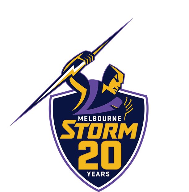
I like it but I feel like it has less character than the previous one. I'd like to see what a non-20 years version of it looks like.
Disappointed to lose the storm cloud and lightning bolt R.
New gear coming sometime this week.
There are two different versions:
And a properly coloured version:
I like it but I feel like it has less character than the previous one. I'd like to see what a non-20 years version of it looks like.
Disappointed to lose the storm cloud and lightning bolt R.
New gear coming sometime this week.

-
brisbanestorm
- Hail Storm
- Posts: 294
- Joined: Mon Jul 09, 2012 7:25 pm
I actually much prefer the version without the gold. It looks less "tacky", for lack of a better word.
I don't have a problem with there being some gold, infact I'd prefer it, but in that second logo the gold is far too dominant.
Perhaps there could have been gold where the white is on the outline of the shield.
One thing that I really miss about BLK is the end of season sales. One month later and nothing has dropped in price on the ISC shop

Really like both, prefer the non coloured version. Perhaps if just the lightning bolt was gold...?
I wasn't keen on seeing a logo change but I think they have done a good job. Looks sharp and contemporary.
I wasn't keen on seeing a logo change but I think they have done a good job. Looks sharp and contemporary.
Well here’s the jersey. Not entirely sold on the neck but that’s a very minor thing for me and overall think it’s a cracking jersey, best in a long long time and perhaps ever imo. How good is it to see the yellow back?
http://www.melbournestorm.com.au/news/2 ... _year.html
http://www.melbournestorm.com.au/news/2 ... _year.html

Huh... Away jersey is very underwhelming IMO. Should have kept the chevron like this year but with the new style template from the home jersey. This looks quite plain.
Last years away jersey was almost a pre-cursor to this years home jersey. Should have slightly revamped it but left it most intact. Was a really nice away jersey last year.
Last years away jersey was almost a pre-cursor to this years home jersey. Should have slightly revamped it but left it most intact. Was a really nice away jersey last year.