New 2015 Jersey
Each year my members hat just ends up in a clothes donation bin because I never wear it. They feel cheap and look tacky. I barely wear the scarf but at least that's a reasonably good quality item. The thing is - I have nicer Storm scarves with better designs. Now if they made the members scarf something classy like a simple purple, navy and white tartan scarf with member embroidery that's something I'd (probably) wear each week.
One thing I wish the club would take better control of is the colours used across all merchandise - especially the purple. Whether it's official BLK gear or supporter gear produced for the NRL, there aren't consistent colours. The purple is either too dark, too light, too close to blue, too close to pink - and so on. The colour purple is such an important part of our branding and yet the club doesn't seem to care as much as they should.
One thing I wish the club would take better control of is the colours used across all merchandise - especially the purple. Whether it's official BLK gear or supporter gear produced for the NRL, there aren't consistent colours. The purple is either too dark, too light, too close to blue, too close to pink - and so on. The colour purple is such an important part of our branding and yet the club doesn't seem to care as much as they should.
Totally agree on the color control, as mentioned in my previous post the cap and the scarfs purple are absolutely nothing alike and it's a joke. Surely they have someone to sign off on these things before being produced? Not just the quality control of the colors but the designs, you can only assume that they don't because if they did that person would say "These a fecking ugly"
Just for reference, this is the official Storm purple: http://www.pantone.com/pages/pantone/co ... ?c_id=5494
I get that matching colours can be difficult when you're using so many different materials on so many different products - but there shouldn't be so much variation.
I get that matching colours can be difficult when you're using so many different materials on so many different products - but there shouldn't be so much variation.
Ye Gods, the memory hasn't faded as much as I thought. The number is 2602.absentee wrote:Just for reference, this is the official Storm purple: http://www.pantone.com/pages/pantone/co ... ?c_id=5494
I get that matching colours can be difficult when you're using so many different materials on so many different products - but there shouldn't be so much variation.
-
KingHoweofIsrael
- Thunderstorm

- Posts: 636
- Joined: Sun Apr 25, 2010 9:48 pm
Whoa.... that heritage jersey should be the main one for sure! Looks awesome! Take my money now! 
-
LESStar58

- Tropical Cyclone
- Posts: 2138
- Joined: Wed Jul 28, 2004 6:50 pm
- Location: balls deep in your love...
- Contact:
Got a $500 Myer voucher for a work milestone and bought a fark ton of Rebel vouchers from Target to buy a pair of running shoes and stock up on Storm gear (Bourke St Store has an okay range) only to find I have to wait 24hrs to use the vouchers.
not happy. Had a media polo and a training tank put aside for me so have to get them tomorrow.
not happy. Had a media polo and a training tank put aside for me so have to get them tomorrow.
-
LESStar58
- Tropical Cyclone
- Posts: 2138
- Joined: Wed Jul 28, 2004 6:50 pm
- Location: balls deep in your love...
- Contact:
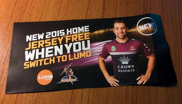
just saw it in person for the first time. It doesn't look too bad actually. I've come around.absentee wrote:If you received your membership renewal pack today, you would have found this inside:
Thoughts?
I've seen a lot of negative reactions on Twitter - I must be the only one who likes it. Yes, it's different - but it's simple. Plenty of navy, plenty of purple and no lines, stripes or piping cluttering things. This jersey relies on the strength of our colours and I think our colours alone make for a solid jersey.
Surprised to see a new one for 2015, actually - we've only had the current one for two years.
I have both the home and the away. They look great. The retail versions are a bit different to the player issues and the images on the BLK store. I think the retails look much better. The most noticeable difference on the away is the lower Crown Resorts logo - now it's balanced instead of being too high up. I'd imagine the players' version will look like that. I think the images on the BLK store are prototypes because the heritage alternate has had the Programmed logo Photoshopped out.
Looks like Lumo is gone as well - their logo is gone from the club website. They signed a three year deal last year so I wonder what happened. And here I was thinking we were finally set with sponsors in every available spot - no upper back sponsor and no shorts sponsor on the front or back. No sign of Jayco either.
Looks like Lumo is gone as well - their logo is gone from the club website. They signed a three year deal last year so I wonder what happened. And here I was thinking we were finally set with sponsors in every available spot - no upper back sponsor and no shorts sponsor on the front or back. No sign of Jayco either.
-
LESStar58
- Tropical Cyclone
- Posts: 2138
- Joined: Wed Jul 28, 2004 6:50 pm
- Location: balls deep in your love...
- Contact:
Looks like all clubs are taking the NBA jersey route and putting the official twitter hashtag on the inside collar.absentee wrote:It's now up for pre-order on the Storm online store: http://www.melbournestormshop.com.au/pr ... 344ppl.htm
No Programmed on the back - now with @storm on the collar.


-
mattstormy
- Thunderstorm
- Posts: 612
- Joined: Tue Sep 27, 2011 1:43 am
- Location: Next to the corner post
The design and colouring is much better than previous years (mainly due to getting rid of the dated lightning bolts), however I won't be buying one. I just don't like the material and tightness of any current NRL jersey. Call me old fashioned, but at least the old stuff from years ago was able to be COMFORTABLY worn by fans.
You wonder why you see so many NRL fans support their clubs by wearing replica retro jerseys designs from 20-30 years ago.
You wonder why you see so many NRL fans support their clubs by wearing replica retro jerseys designs from 20-30 years ago.
-
LESStar58
- Tropical Cyclone
- Posts: 2138
- Joined: Wed Jul 28, 2004 6:50 pm
- Location: balls deep in your love...
- Contact:
I found me a Nike 1998 jersey a few months back on ebay. Cost fark all and is size 2xl so I know the feeling.mattstormy wrote:The design and colouring is much better than previous years (mainly due to getting rid of the dated lightning bolts), however I won't be buying one. I just don't like the material and tightness of any current NRL jersey. Call me old fashioned, but at least the old stuff from years ago was able to be COMFORTABLY worn by fans.
You wonder why you see so many NRL fans support their clubs by wearing replica retro jerseys designs from 20-30 years ago.
I think my Australia jersey by Canterbury (the current version) is the nicest one I have. The fabric is very light and comfortable and the cut feels spot on, although I do go a size up on what I'd usually wear. The fabric BLK uses tends to cling a bit too much and I think the new template is a step back from what they had last year. If we could get Canterbury back as apparel partner I'd be very happy.